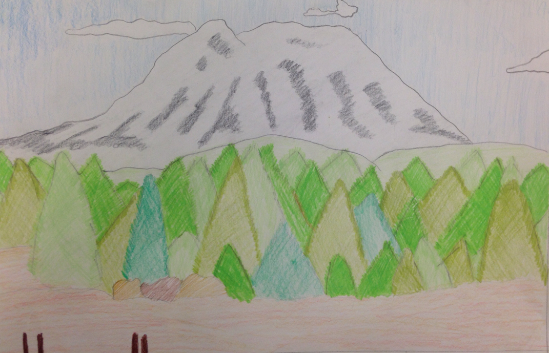
 I decided to start use colored pencils this time in hopes it would be easier. It was not. My muse was Mt. Rainer, though the trees are out of proportions (something I will have to work on) I tried to use a variety of light and bright greens. I did an overal shading of bright green behind the trees to give illusion to a cascade of more trees. I enjoyed this project more. 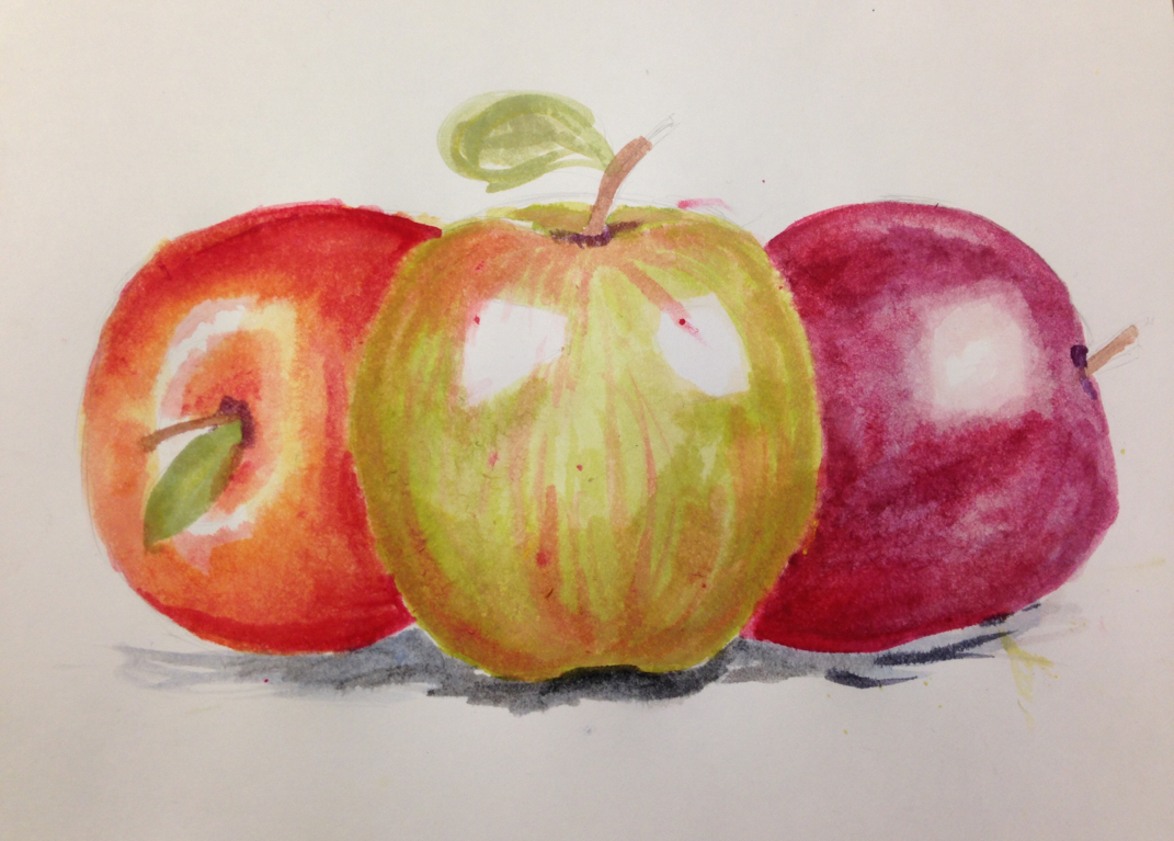 In order to get an idea of 2-D painting, I was able to learn from painting the apples as to how to shape, shadow and use light colors first. I drew out the apples, and thenI started out with yellow on every apple in order to make them look more realistic. I mixed in green for the front one, darker towards the top and bottom. same for the red one, darker reds mixed with purple to give shadows. And then blue mixed with red to give an even darker shading. I underlined the bottom with blue and finished off with stems and leaves. Overall I enjoyed this project, it was easy enough to understand and finish.  The name of this assignment is the Disney drawing. One new skill that I used was the proper way to shade when using water colors. The medium used for this project was water colors. Some art elements used are lines value shape and form. These gave the project emphasis and balance. This project is important because I leaned how to make a nice painting with a lot of detail. 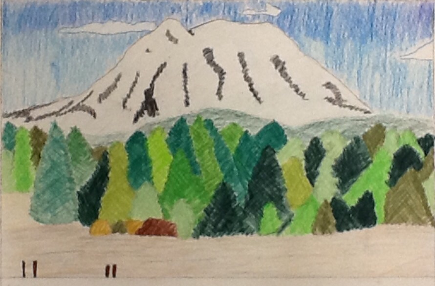 I decided to start use colored pencils this time in hopes it would be easier. It was not. My muse was Mt. Rainer, though the trees are out of proportions (something I will have to work on) I tried to use a variety of light and dark greens. I did an overal shading of dark green behind the trees to give illusion to a cascade of more trees. I enjoyed this project more. 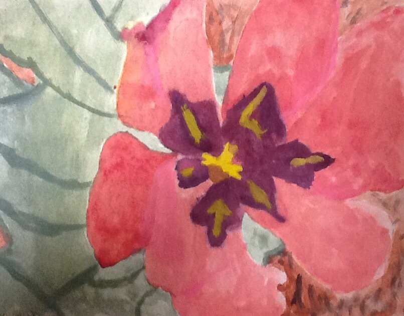 I began this macro-still life of the flowers at the front of the school with a simple sketch and then began painting with the lighter colors underneith. A light red with a tint of yellow in order to make the pedals look lively. I incorporated whites to add more highlight and then purples to bring in shadows. I'll be honest in that this wasn't my favorite piece, however through this I learned that black is not the way to go when shadowing and to always start wit be lights first. 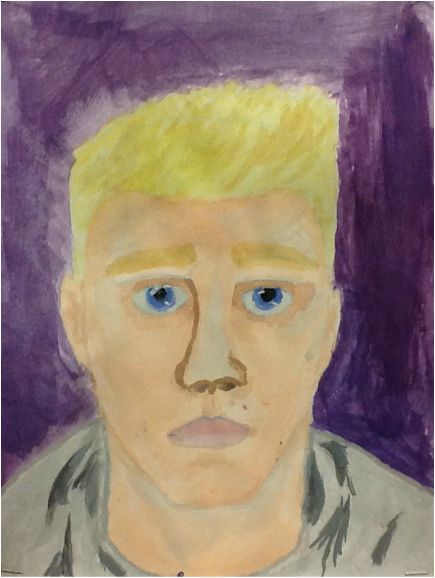 Here is my first self-portrait that I did in water colors. I used contrasting colors to make the blue in my eyes and blonde hair look brighter. I was able to add in darker shades into my sweatshirt and my neck to look more 3D. From all this I was able to learn how to use certain brush strokes and colors to establish emphasis and realism. I overall enjoyed this project, and was happy to learn and use my skills. |
